
For this project I was asked to create a seven page magazine that included a cover, Table of Contents, monthly column, double jump spread, and featured article. I created all the artwork as well as writing all of the text myself.
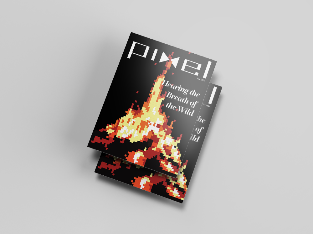
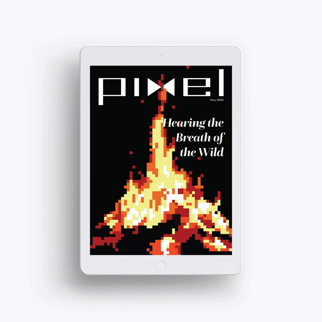
I chose to base my magazine on design in video games, and focused the particular issue on sound design. Breath of the Wild has phenomenal sound design and is one of my favorite games, so I chose to write about that as the featured article, and to base the cover art on the game.
For the cover, I wanted to display elements of the game that are known for their distinct sound or that are central to the Legend of Zelda franchise.
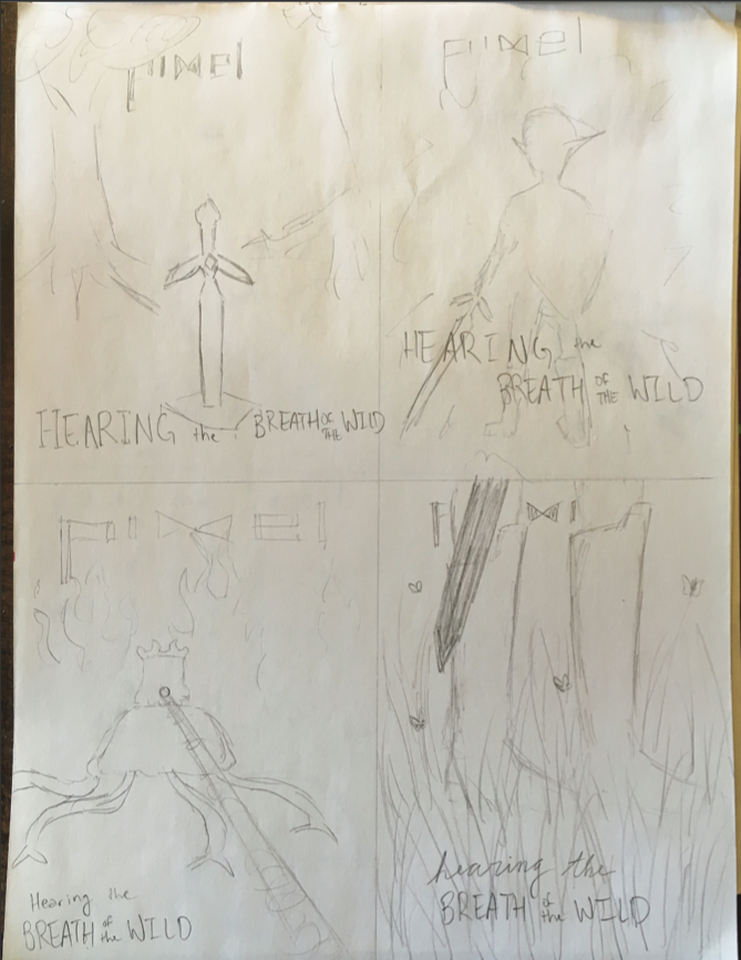
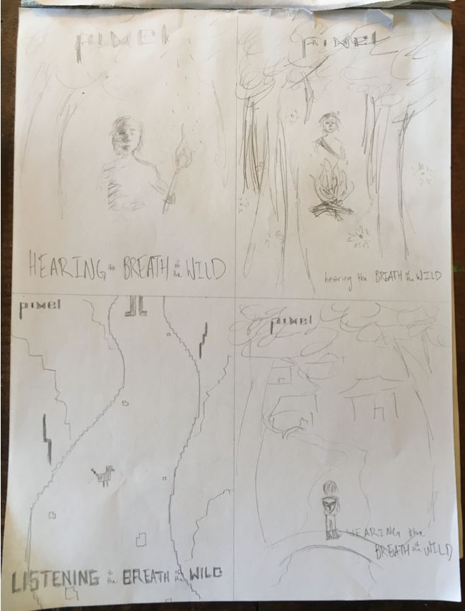
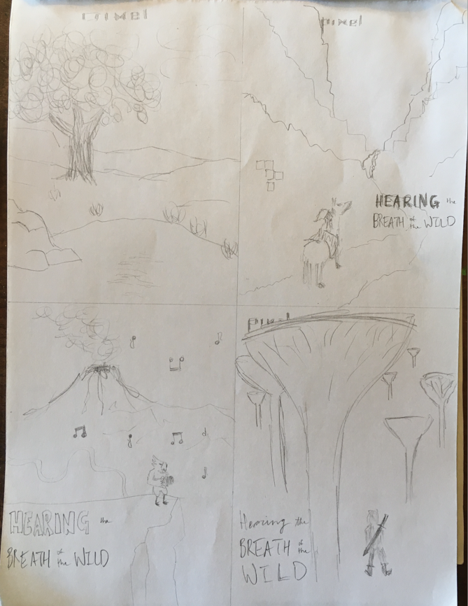
As for the magazine logo, I wanted to capture a video game style. I drew inspiration from vintage arcade typography and logos and settled on a blocky, angular wordmark that subtly incorporates a play icon.

I designed a print and mobile version of the magazine cover with appropriate dimensions to fit these different platforms. To make the digital cover more engaging and take advantage of digital capabilities, I animated the pixel flame.
On the Table of Contents, the biggest challenge was fitting a multitude of information neatly into one page. I also needed to hierarchically emphasize the featured article over the other contents, which posed another challenge. I chose to use scale and limited color to draw attention to the featured article. Another challenge was cleanly blending the Contents page into the neighboring. page, the monthly column. I continued the limited color palette and simplified illustration as a unifying tool. Of course, consistent text was another important factor that enhanced the unified look.

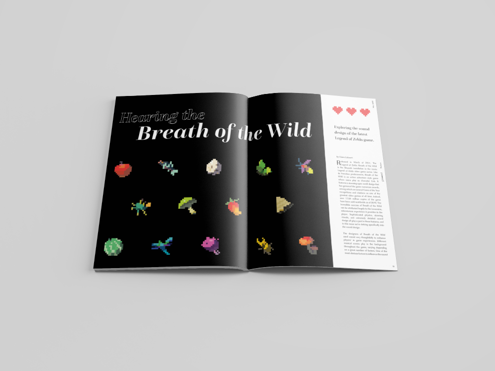
Perhaps my favorite part of this project was creating the pixel "sprites" (as I learned they are called) for the double jump spread introducing the featured article. Creating pixel art was new for me and I enjoyed the process greatly. The biggest challenge creating this spread was incorporating the article text in a way that was both legible and aesthetic. I knew that white text on a black background was a legibility issue, so I incorporated a white bar to highlight the body text and lead the reader naturally into the next spread.
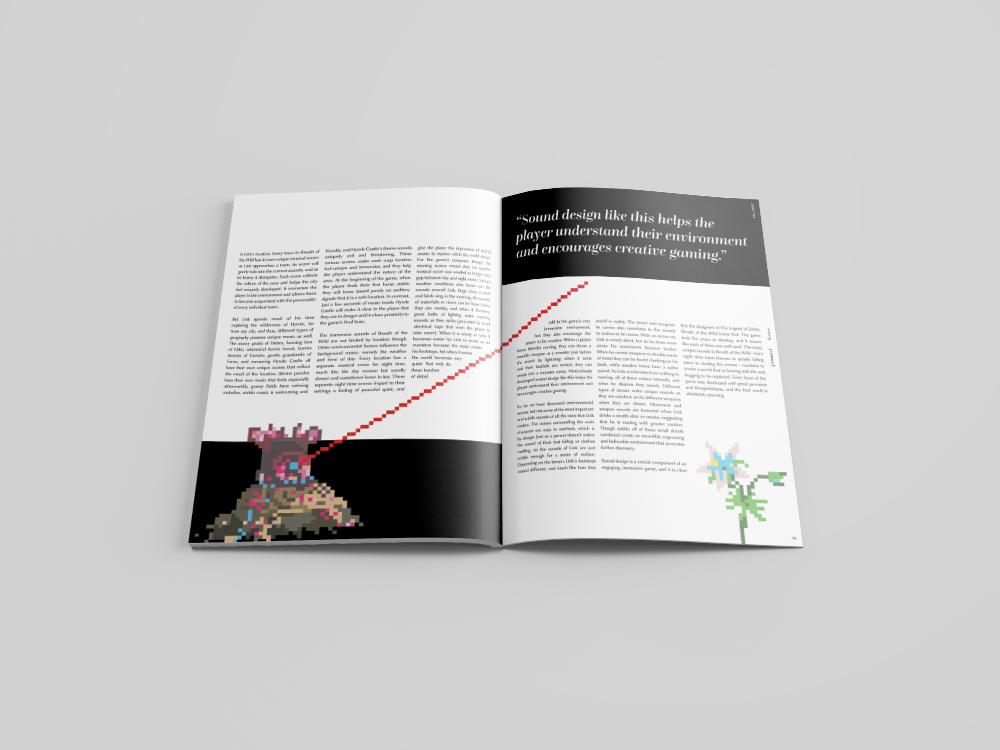
For the final and most text-heavy spread, I knew that I wanted to include a dash of illustration to relieve the reader from the amount of text. It was a struggle figuring out how to incorporate illustrations in a way that felt like it belonged, but that did not interfere with the text too much. My solution was to wrap the text around the illustration in a couple places, just enough to integrate the features with one another.
I am extremely pleased with how this project turned out. Creating a consistent visual language across seven unique pages was a huge challenge and I feel that I handled it very well. Each spread had its own purpose and posed a different challenge in terms of content organization, hierarchy, and consistency. Carefully considering each of these factors was overwhelming at times but necessary for a cohesive and legible product. I am glad I had the chance to wrestle with these issues and arrive at a design of which I am proud.
If you'd like to check out the magazine pdf for a closer look at the pages, you can see that here.