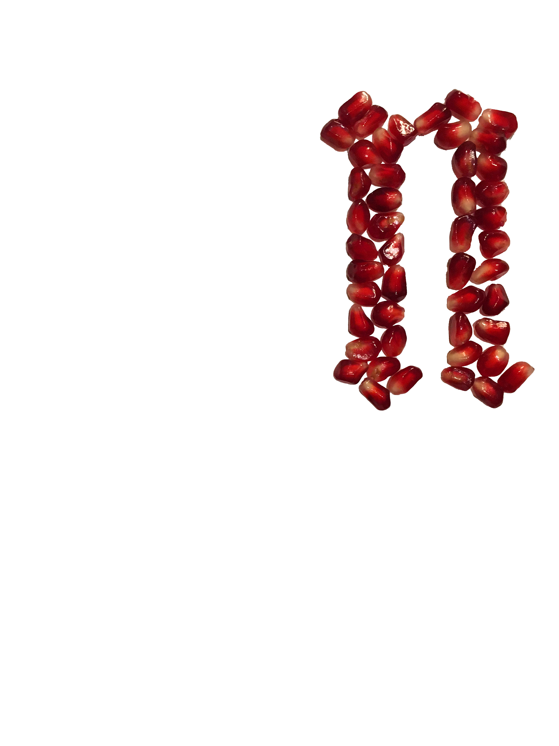
This personal project was a hands on exploration of typography. I always love getting away from purely digital work, so this was a super enjoyable, if painstaking, process.
I wanted to use physical items to create letterforms, and I wanted these letterforms to feel representative of their material. I chose to use pomegranate because I think it has a sort of grandiose feel that would work well with blackletter.
First, I printed out the letterforms I needed, traced them in faint pencil lines (for easier photoshopping), and painstakingly arranged pomegranate arils to fill out the letterforms. I then photographed each letterform, and brought it into Photoshop.
After building out the letterforms, I isolated each letter from its background in Photoshop.


Finally, after isolating each letter, I brought them all together to build the final composition. I placed the letters on a blank background as well as a pale yellow and I've never been able to decide which I prefer, so you can check out both! I highly recommend zooming in on the photos on this page so you can appreciate the textures I was able to capture.
